11 Lesser-Known Fonts For Tattoos That Make For Cool-As-Hell Ink
Choose wisely.
 getty
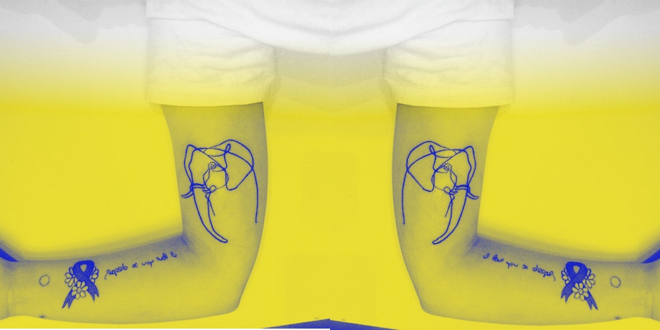
getty I started getting tattoos the day that I turned 18. For reasons that do not paint Young Becca in such a great and mature light, I really, really wanted to get a gigantic sword on my back. I sat and clutched my friend's hands and made her tell me stories for the two hours it took to get the piece done, carefully selecting from the different fonts for tattoos. It was beautiful and I was hooked, hooked, hooked.
Now, I'm not exactly a painted lady, but I've been steadily adding to my collection ever since. I have cats on the inside of my wrists, a couple of others in places that I would rather not disclose, and finally, I have the letters "tk" tattooed on my collarbone.
Like a lot of folks who are into tattoos, I stayed away from getting anything with script for a very long time.
It wasn't because I didn't have words that I wanted to cover my body, but because I had seen so many horror stories (online and in real life) of text gone wrong, mistranslations, or plain on spelling errors. I would be miserable if I were to get a word tattooed on me spelled wrong, and frankly, I knew I'd have no one else to blame but myself.
When I did decide to get the letters "tk" tattooed on my collarbone, it took me and the tattoo artist I was working with close to an hour to find exactly the right font for the ink. When you're getting an image tattooed on your body, you can trust that all of the elements — line, color, design — will work together to create something special that you'll love.
When all you want is text, it's trickier to choose because all you have is the font to guide you. There are good fonts for tattoos, there are bad fonts for tattoos, and well... there are lots of fonts that just fall somewhere in between.
If you're getting a text tattoo and you're worried about the font you pick, you're right to be worried — it's a big decision! That's why I've broken your font options down to just 11. Find out what they look like, what makes them awesome, and what might make you think twice before picking each font for keeps.
1. FF Pitu
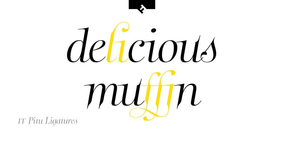
Pro: This font is described as being "voluptuous" and "if Kim Kardashian had class." So rest assured knowing that your choice has curves in all the right places and also quietly slams a Kardashian.
Con: The words "Kim Kardashian" will forever be associated with your newest tattoo.
2. Pompadour

Pro: If you're working out something numerals, each one in this font are designed to fit into a square. Doesn't get much nicer and much tidier than that!
Con: Keep in mind that the entire font was inspired by 1950s rockabilly, so you're bound to get a lot of dudes with bad approximations of 1950s hair trying to mansplain your font to you.
3. Sugar Pie
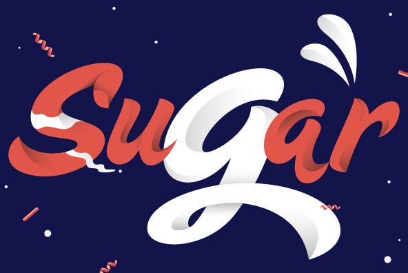
Pro: If you're looking for something ornate that's still playful, you won't find options that are beat out this old favorite. This one gets bonus points for readability!
Con: With a name like "sugar pie" you probably won't be surprised to find this font on a lot of dessert and baking products in the grocery store. If you can stomach the shame of matching your favorite bag of granulated, then all the more power to you!
4. Karmaform

Pro: To me, the best thing about this font is that it makes a real impact without making a mess. Trust, if you're looking for clear readability for your tat, this one can get the job done.
Con: You will always have to tell people who ask you what the name of this font is. You will have to say it out loud. Probably a couple of times. You will feel more foolish each time that you do.
5. Bello
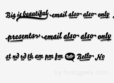
Pro: Just like yours truly, this font is big, and beautiful, with lots and lots of curves. It's an eye-catching font, and if you've got a name you want inked on your body, it's a great choice.
Con: Because this is a brush-font, it won't look as clean on your body as you probably imagine it will.
6. Bready
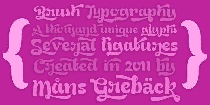
Pro: This is another brush-font, but unlike Bello, Bready is totally legible, no matter how many words you have inked out on your (very hot) bod.
Con: It totally evokes the 1970s, so maybe stay away from inking down words like "radical."
7. Tomate

Pro: This is another example of a clean-printed brush-font. As big and as juicy as its name sounds, using this font will definitely catch eyes on your ink.
Con: It was designed to go on mass-consumer goods. You are not a mass-consumer good. You're a human being. Please remember that.
8. Lobster

Pro: This script font was super-popular as a font for tattoos for a long time, because it's classy but still legible cursive.
Con: Everyone has used this. Everyone. Everywhere. If you want a unique script tattoo, try your own handwriting. Unless, like me, yours resembles that of a budding serial killer.
9. Freehand 521
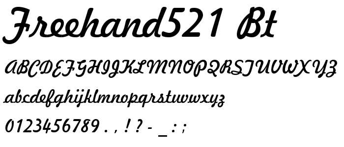
Pro: The great thing about this font is that it is a familiar, and predictable cursive style. It's a great choice if you are confident in your artist's lettering abilities.
Con: WHY ARE YOU USING A TATTOO ARTIST WHOSE LETTERING SKILLS YOU QUESTION? NO. GO ELSEWHERE.
10. Cream Puff

Pro: The best thing about this font is its name — and also it's smooooooothe ligatures, mmmm yeah, yummmmmmy.
Con: Everything is going to look cheesy or overly cute in this font. So I suggest it primarily for swear words.
11. Studio Lettering
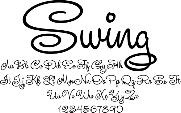
Pro: If you want to have a vaguely "Disney" style look to your text, this Disney-inspired lettering is the business.
Con: I want you to think long and hard about your age, your lifestyle, and your plans for the future before you get any sort of Disney-related thing tattooed on your person, okay? You owe your body that.
Rebecca Jane Stokes is a writer living in Brooklyn, New York with her cat, Batman. She hosts the love and dating advice show, Becca After Dark, on YourTango's Facebook Page every Tuesday and Thursday at 10:15 pm Eastern. For more of her work, check out her Tumblr.

